How Bad is Your Commute?
Some of the first graphics that I recreated came from a Global Commuter Survey conducted by IBM in 2010. I stumbled across the graphics as I prepared a blog post to announce the second course I created with Udacity.
Both of the graphics could be improved dramatically and for two very different reasons. I think the first graphic suffers from poor styling while the second graphic could be improved by choosing a different visual encoding. The visual encoding is how a datum is represented visually. The visual encoding could be a point in space, the length of a bar, a color, or in the case of the second graphic the area of a circle. I’ll explain what I find troubling in each of the graphics, and then I’ll present my remake at the end of this article.
Styling Choices
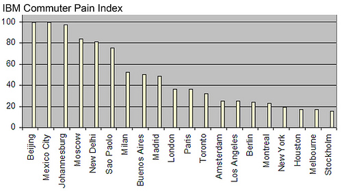
The first graphic is difficult to interpret for three reasons. First, the width of each bar is too small. It’s hard to read the graphic because the thin bars cross with the black major grid lines, which creates a lot of visual noise. Secondly, the dominate color in the graphic is grey (the background color of the plots area), which puts less emphasis on the bars. The yellow bars sit in a sea of grey and don’t pop out from the plot area. Finally, the bars appear off-centered from their corresponding labels, and those labels are difficult to read because they have been rotated vertically 90 degrees. Labels on the x-axis for vertical bar charts could be rotated by 45 degrees clockwise for easier reading. In general, I prefer horizontal bar charts and try to keep all of the labels oriented horizontally.
Visual Encodings
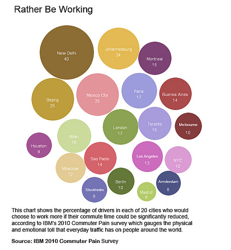
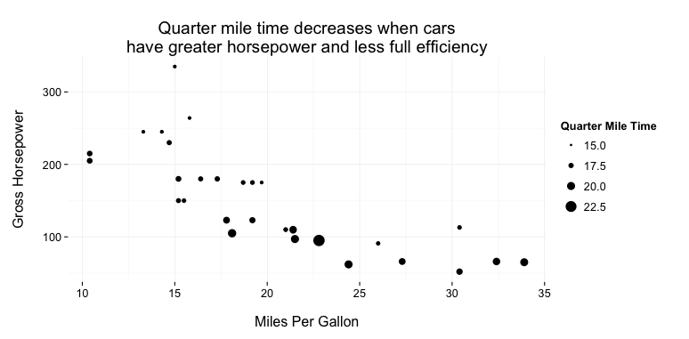
The bubble-like chart showing the percentage of commuters who would rather be working rather than commuting is tough to digest. I call the graphic a bubble-like chart because the graphic only displays one value across all the cities: the percentage of commuters who would rather be commuting than working. Bubble charts typically display three data attributes for every circle or bubble. Data attributes are usually mapped to an x position, a y position, and a size for the bubble. Here’s an example of a bubble chart using the mtcars data set in RStudio.
Going back to the Rather Work graphic, New Delhi certainly stands out as the largest circle in the top right, but the other circles are relatively close in size, which makes visual comparisons difficult. I found myself constantly going to the read the labels rather than scan the size of the circles. In doing so, I felt like I was reading a disorganized table of values (values not even aligned in columns) rather than a data visualization. So what’s the problem here?
Well, the area of each circle is proportional to the percentage of commuters who would rather be working. However, our eyes have difficulty perceiving differences in area. Take for example the following graphic. Which pair of shapes below do you think is twice in size as the others? Is it the green rectangular bars, the red squares, or the purple circles?

It turns out that version B is exactly double the size of version A in each of the pairings. The bar was probably the easiest to notice and that’s because our eyes can easily distinguish between length when bars are align to a common baseline. The area of squares and the circles are much harder to compare to one another. If you’re interested in the research behind graphical perception and why bar charts are optimal for quantitative comparisons, check out William Cleveland and Robert McGill’s paper on Graphical Perception.
The Remake
The following graphics were made in R. I made some final touch ups using Inkscape to reposition the numerical labels and to color them.

Like the first original graphic, I sorted the cities by the commuter pain index. I remove a lot of the chart junk - the grey background, the major y-axis grid lines, the x-axis ticks, and the right border on the plot area. I even removed the y-axis and instead opted to put the numerical labels directly on the bars. The visualization draws the eye towards the worst cities at the top of the diagram and the less “painful” cities towards the bottom of the chart. Additionally, color serves to draw the eye to particular cities: Beijing, Mexico City, and Berlin. Color might seem like an odd addition to the bar chart since I’m not actually encoding data with the use of the orange color. Let me connect the use of color to the remake of the second graphic.

Notice that even though Berlin’s pain index is about a quarter of Beijing and Mexico City (from the first diagram), the same percentage of drivers would prefer to work.
Commuting can be a pain but making sense of data should be easy. Great visualizations can let us do that, and one must carefully consider both styling choices and visual encodings when presenting data.