Using Consistent Patterns
Ever since making a Product Design course with Google, I have been fascinated with product design, user experience, and user interface design. In particular, I’ve started becoming more aware about how I use particular software products, the tasks and goals those products help me achieve, and where they fall short.
While checking my email recently, I encountered a very small problem while using Gmail on my mobile device. I’d like to outline that problem in more detail, talk about how it might be alleviated, and highlight why it’s important. As an aside, I currently have an iPhone5 so perhaps the experience is different on other devices.
The Problem
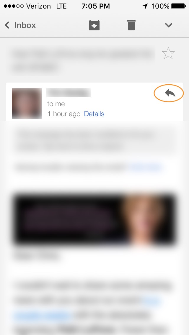
I check email most mornings, and as I checked my email on Saturday morning, I came across an email that I knew I wanted to forward.
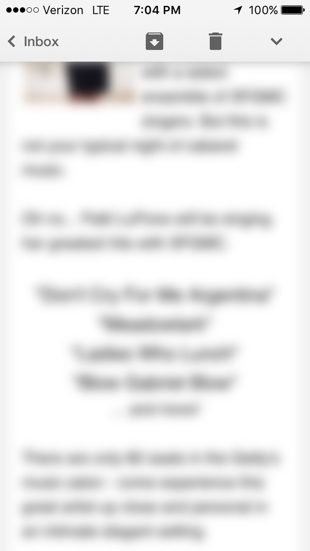
The email content has been blurred out for the sake of privacy (but for the curious readers, the email contained an invitation to a Patti LuPone concert). I was midway through the email, and instantly I knew to whom I wanted to forward the email. That’s when I went looking for the forward button.
There isn’t a forward button or reply button in the main content section of the email (the part of the photo that is blurred out). And unlike Google Maps or Gmail on Android, there’s no floating action button that’s “sticky” and always present on the screen in some form.
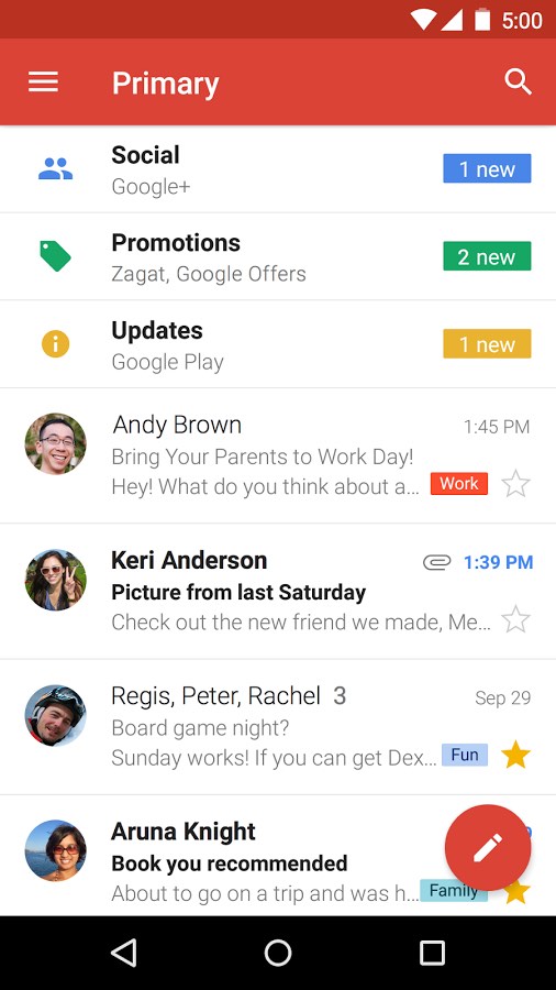
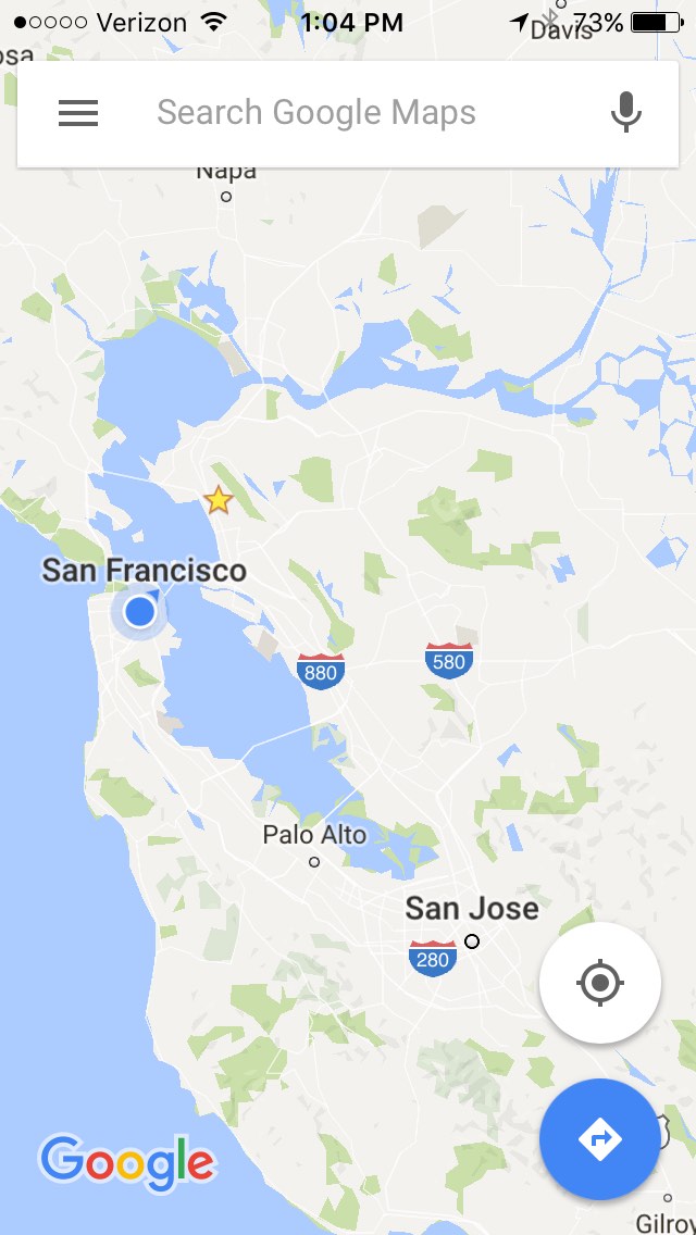
Examples of Floating Action Buttons
Looking again at my options (see below), it looked like I could either go back to my inbox. I could move, archive, or label this email by tapping the box icon with the down arrow in it. To be honest, I don't know what tapping that icon does because I've never used that feature. I could also delete the email by clicking the trash can icon, or I could see a list of other options by clicking the down arrow at the far right of the top menu.
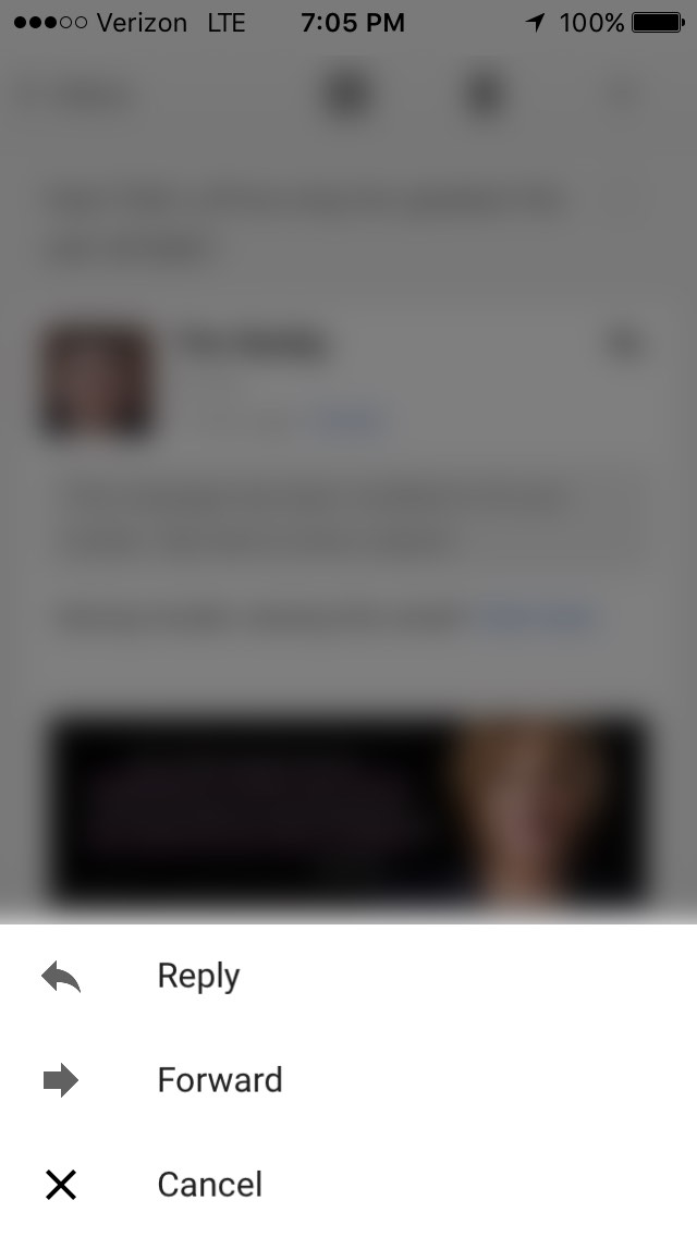
I clicked on the down arrow and encountered the following screen.
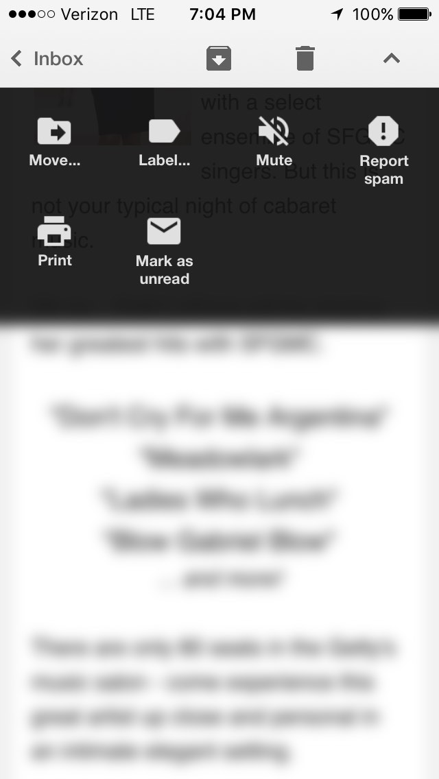
This seems reasonable. I can move an email, label it, or even mark it as unread. I’m not quite sure why I would need to mute an email, but maybe there’s something I can do about muting emails from a sender? ¯\_(ツ)_/¯ The most surprising thing about this screen was that I don’t have an option to reply or forward an email. I thought this menu would contain the main actions that I could take with an email, but instead, the menu comprises a list of what I would call secondary actions, with the exception of “Mark as Spam”.
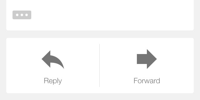
Now, here’s where I get a little confused as a user. I know the forward button must be around here somewhere so I look harder. I scroll back to the top of the menu and I see this.
I hesitate to click on the reply button (the backwards arrow) because I don’t want to reply to the email but instead forward it. There’s no label on the icon so my best guess it that I’ll be taken to a screen where I can reply to the email with Gmail pre-populating the “to” and “from” fields.
I take my chances and tap the backwards arrow, and then I see this menu.
Phew, I can actually forward this email. Task complete!
The problem with that last step, however, is that the single reply arrow breaks my mental model of icons. I typically think one icon equals one action. A trash icon deletes an email. A downward chevron (arrow) shows me more menu options. But the reply button, let’s me reply, reply all (in some cases), forward, or cancel.
Now in all fairness, I spent about 10 seconds trying to figure out how to forward this email, but I don’t believe it should have been this hard. Part of the problem is that I scanned a long email, and I wanted to take action mid way through the email. If I would have scrolled to the bottom of the email, I would have easily encountered the reply and forward buttons.
The Solution
The solution seems fairly simple to me. I’d probably duplicate some of the main email actions in the drop down of actions after clicking the down chevron. This menu is available throughout the entire time while reading the email, which gives the user more control and avoids what might be rare or edge cases like mine. Another option would be to use a label on the reply button at the top of the email and also add an option to forward with a label. There’s enough screen real estate at the top of the email to permit the additions.
Why It Matters
Making a great product that helps users should be a desirable goal for any business hoping to attract and retain its users. And with over 1 billion people on the planet using Google Chrome and Gmail, it’s even more important that these products work according to user’s mental models so that people can save time and just “get things done”.
Take for example, Google’s Chrome Extension Manager. I’d typically want to go to the extensions manager to…
- see my current Chrome extensions
- install a new Chrome extension
- remove a Chrome extension
- update some or all Chrome extensions
At the top of the menu, I see this…

So again, I have to think about where I might go to add an extension. It takes me a few seconds, and then I remember it’s located at the bottom of the page after scrolling past all my chrome extensions.

A simple solution would be to move the “Get more extensions” link to the top of the page, perhaps placing it next to the Extensions main heading. The user interface design doesn’t necessarily break a user’s mental model for what particular icons and buttons do. Instead, I think the placement of the link deviates from users would expect to find the link.
I ended up paging down which saved some time, but I can’t help but think that at least one third of Chrome’s users have faced the same problem — it might even be a contributing factor to why only one third of Chrome users had installed at least one Chrome extension by June 2011.
1 billion people * 0.33 Chrome extension users * 3 seconds to figure out
= 990,000,000 seconds
OR
= 275,000 hours
OR
about 11,458 days of time spent discovering navigation for a task
That’s alarming! Now, I’m not trying to say that these products are terrible because they certainly help users (myself included). If anything, I think it’s a great reminder of how much care, planning, and testing goes into product development. It’s also a reminder of how important users are to the development of software products and what else might be lurking or hidden in their experiences.